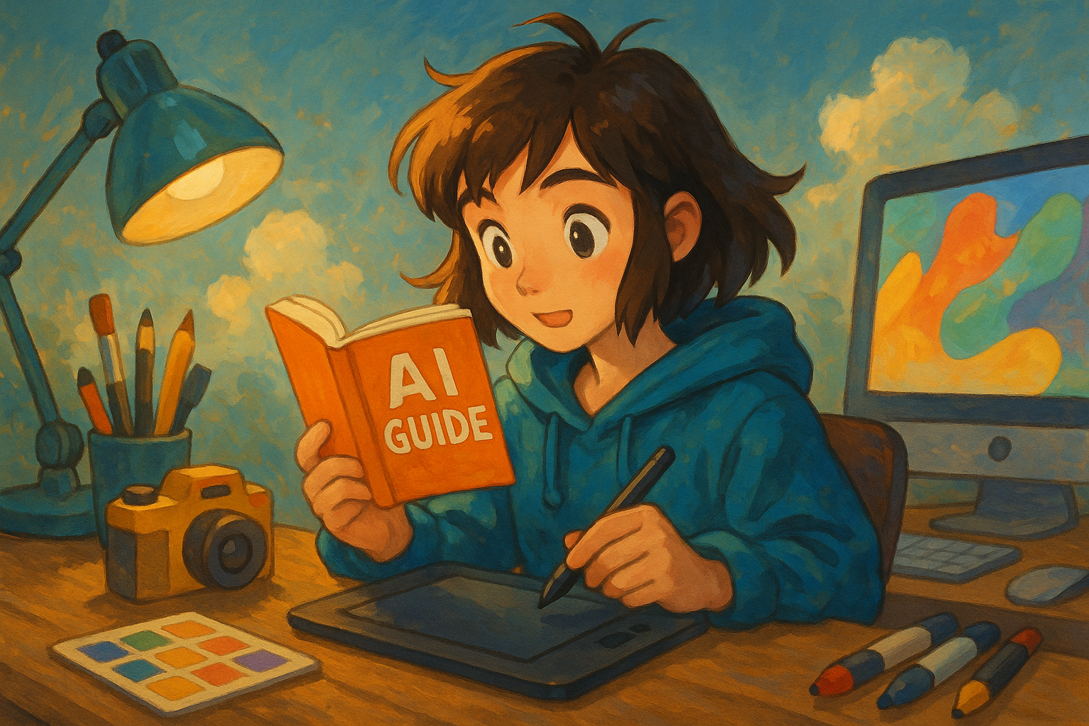
How to create error-free PowerPoint layouts? A comprehensive analysis of 8 common mistakes and practical optimization techniques.
To achieve effective and flawless PPT layouts, you must avoid these 8 common pitfalls.This article compiles the perspectives of designers and presentation experts.Detailed analysis of common errors in fonts, colors, layouts, and animations.And provide practical optimization techniques for each corresponding item.AI-assisted toolsFrom alignment, space, and color scheme to image application, we enhance the professionalism and visual appeal of your presentations step by step.Check your PowerPoint layout now and learn how to create a unique presentation style!
8 common mistakes in PPT layout
According to industry experts and presentation consultants, there are eight common PPT layout mistakes. Knowing how to avoid these mistakes and optimize your presentations will instantly upgrade their quality!
| Common Misconceptions | Specific performance | Solution suggestions |
|---|---|---|
| Font/class mismatch | Misuse of artistic fonts, extreme font sizes, and gaudy colors | Unify font, font size, and appropriate color scheme |
| Alignment/Spacing disorder | The content is crooked and uneven. | Use grid and reference line tools |
| Color design imbalance | Highly saturated colors, low contrast, or overly ornate colors | Control the number of colors and use high contrast to clearly distinguish the primary and secondary colors. |
| Over-reliance on system templates | Rigid and inflexible, lacking personal style | Manually adjust the layout and flexibly split the structure. |
| Visual overload/insufficient white space | Every space was packed, leaving no room to breathe. | White space design, segmented presentation |
| Element/image misuse | The images are too small, blurry, and have a mixed style. | Select high-resolution images of the same style |
| The text is not clearly structured. | Long paragraphs lack structure, making it difficult to identify key points. | Clearly separate the title, body text, and emphasis text. |
| abuse of animation effects | Add tons of entry and exit effects, and scrolling animations. | Animation subtraction, using only appropriate emphasis. |
In-depth analysis: Common pitfalls and optimization techniques
Font and font size usage errors
Avoid artistic fonts and diverse font classes
Avoid overly ornate artistic fonts; ideally, use only 1-2 sets of modern, clear fonts throughout the entire document.For example, fonts like Source Han Sans, Microsoft YaHei, Arial, and Calibri can clearly present the hierarchy by differentiating the titles, body text, and notes through font size.
AI tool recommendations: Available Fontjoy Quickly find the right font combination.
Set a harmonious color scheme and check the contrast regularly.
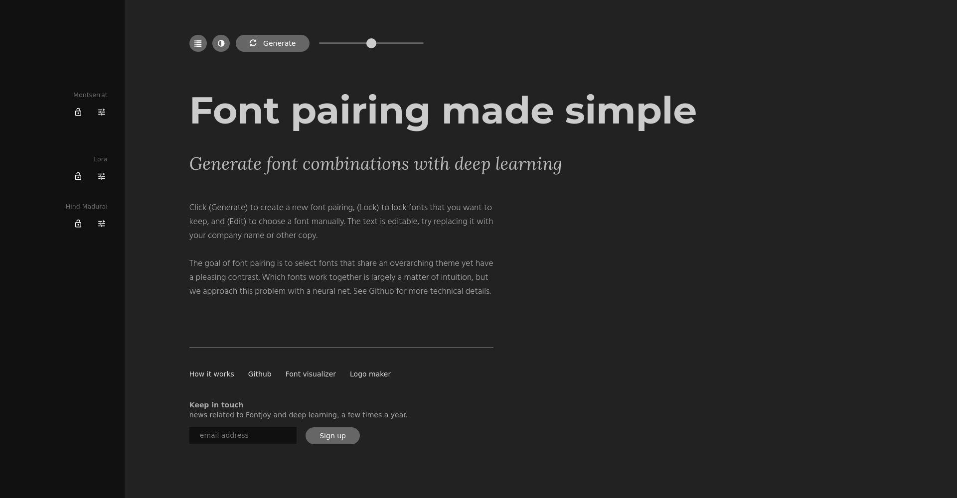
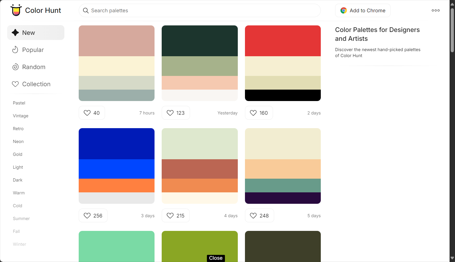
Font color schemeAvoid using strong colors such as pure black, red, and blue. Dark gray is recommended for the body text, while the title should use the theme color. Limit the number of colors to three.And always pay attention to the contrast between the background and the subject. (No inspiration available) Coolors、Color Hunt Generate a color palette.
Alignment and spatial inaccuracies
Layout alignment and deliberate uniformity
Tilting to the left or right and haphazardly placing objects are the biggest sources of an amateurish feel in PowerPoint presentations.It is recommended to enable grid lines and reference lines, ensure all elements have a consistent starting position, and maintain consistent spacing between images and text.
Bonus points for professionalism: Leave more white space between content blocks to avoid elements crowding together.
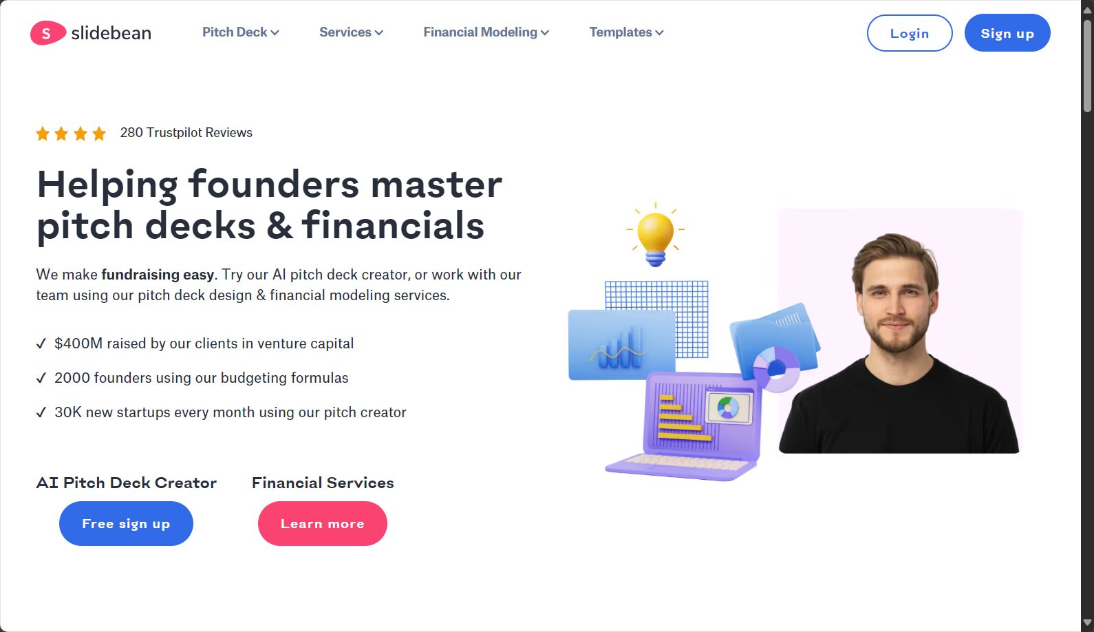
Grid-assisted, spacing automation
Make good use of the built-in grid tools in PowerPoint or Google Slides to help align objects accurately and create uniform spacing.
Beginners are advised to use Slidebean AI-powered automatic layout tool.
Color design issues
High saturation/low contrast makes it easy to overturn.
Please reduce the use of bright colors; 2-3 main colors are ideal. High contrast between the theme and the background makes it easier to read.
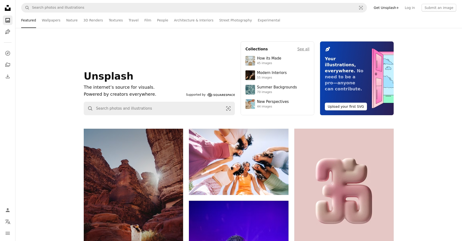
Automated color selection using AI tools
recommend KhromaLet AI automatically generate beautiful color palettes based on keywords and preferences, easily avoiding color-matching hell.
Overuse of system templates or patterns
The template is rigid and difficult to expand the design.
Using templates throughout the presentation can easily result in repetitive and dull presentations. It is recommended to create custom master slides and use segmented designs to emphasize your own style.The layout can be flexibly enlarged or reduced in different sections to enhance the sense of hierarchy.

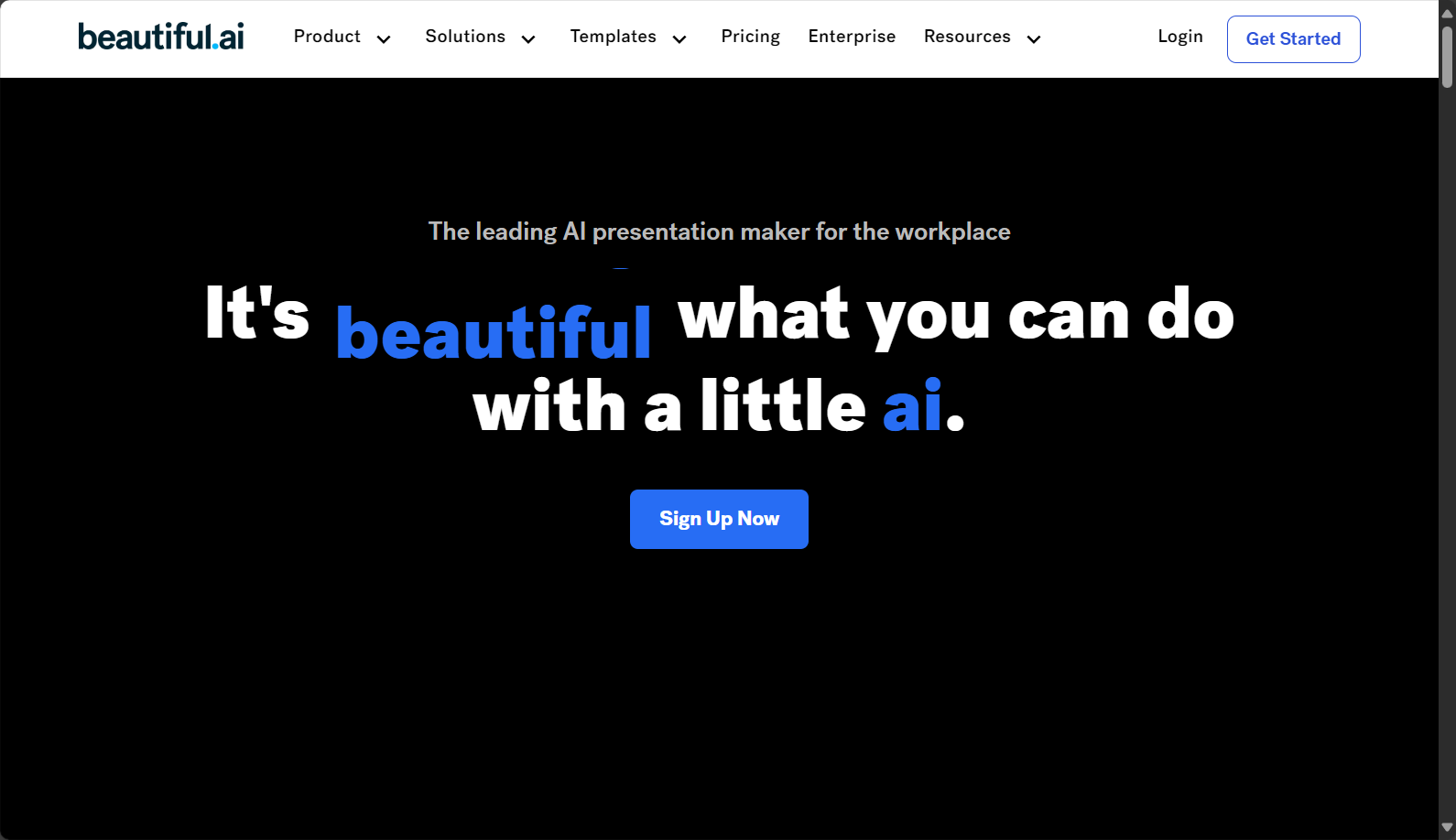
Add a touch of creativity by combining AI-powered presentation tools.
You can try it. Beautiful.ai These AI-powered presentation tools offer improvements in both content and formatting, eliminating concerns about layout issues.
Visual overload, insufficient white space
Learn to "declutter" and design with a sense of breathing.
PPT slides don't need to be crammed full of content.Leave 8-151 TP3T blank spaces on each page.This allows the eyes to breathe, making it easier to focus on key points.
List key points in bullet points, and use appropriate pagination.
A page with more than 7 lines of text or 6 images is considered overloaded and can be split into multiple pages.
If the segments are messed up, you can use Tome AI We'll help you restructure.
Image/element misuse and visual unity
Select high-resolution images with a consistent style.
Each image should have a resolution greater than 1280×720 and maintain a consistent style.For workplace use, it is recommended to choose flat illustrations or real photos to maintain a unified aesthetic.
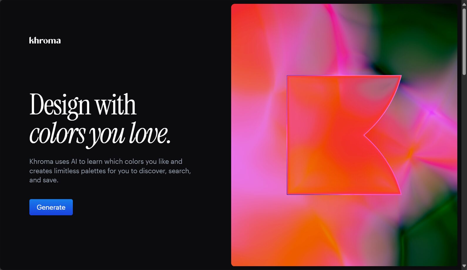
AI Image Library Recommendations:Unsplash + AI Image Search、Canva AI ImageFunction.
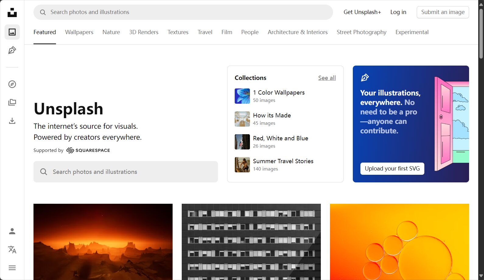
Unified chart and icon format
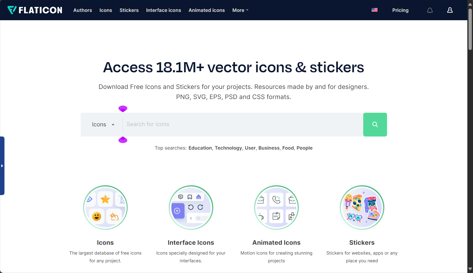
When selecting icons and charts of the same style, it is recommended to use... Flaticon Integrated thumbnail design.
The text is poorly structured and lacks focus.
Clearly define the differences between the title, subtitle, and body text.
Title (18–36pt), subtitle (16–24pt), and body text (12–16pt) must be clearly distinguished.Colors are also distinguished by theme/auxiliary colors.
Visualization focuses on emphasizing the main information axis.
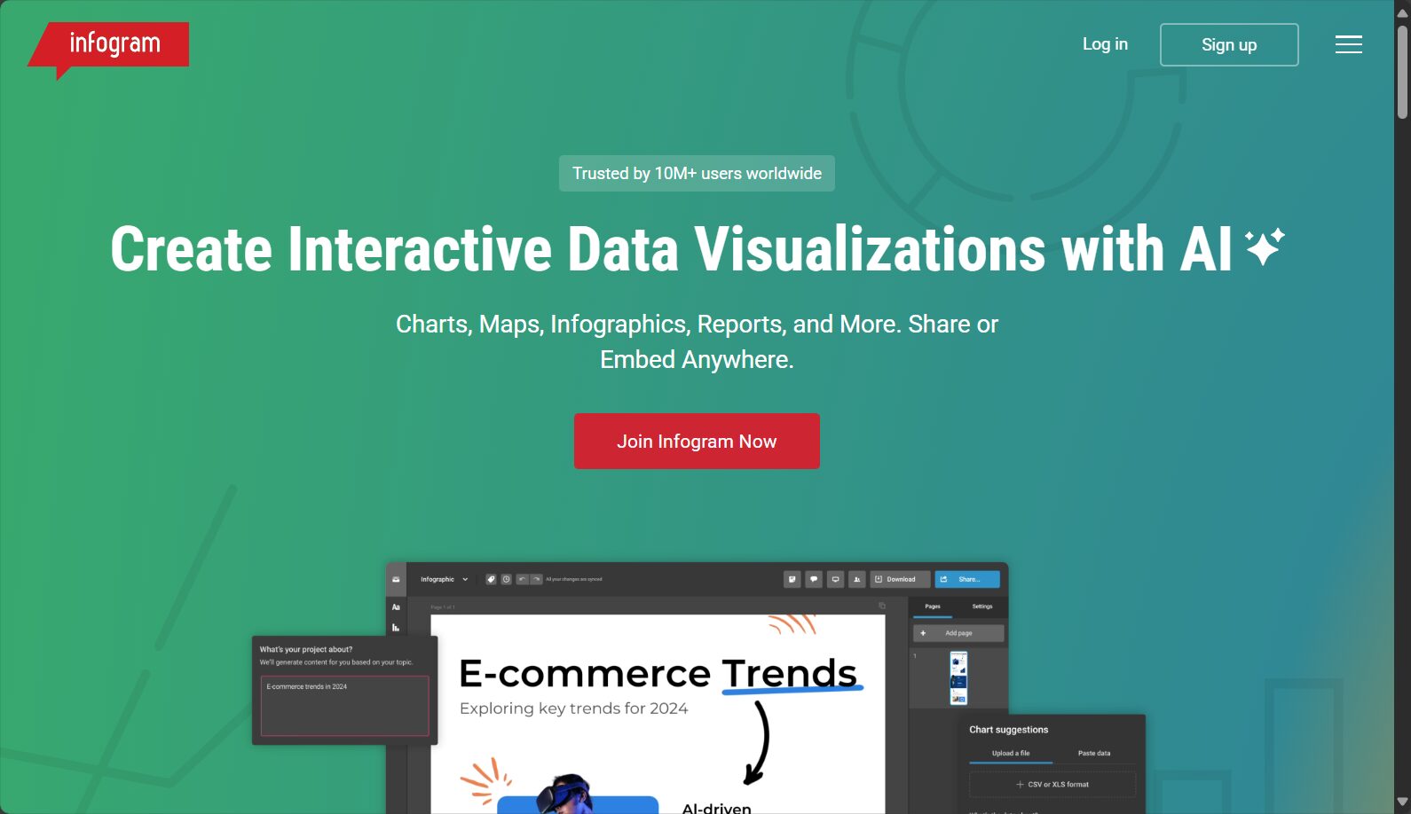
Important data Bold, Reflected Or highlight using a selection box. Large amounts of data are used... Infogram Create charts to help you understand things at a glance.
Animation misuse interferes with information delivery.
Apply the principle of subtraction: use animation sparingly.
Animation effects are limited to basic transitions such as "fade in/fade out" and "wipe," and you should not add flashing effects to every object.
AI-assisted animation rhythm design
Available Gamma App AI automatically arranges the rhythm of object appearance, improving smoothness.
Final Reminders and Extended Resources
The quality of a PPT layout lies in its restraint and attention to detail.Next time you give a presentation, remember to "simplify and highlight the key points, maintain a consistent design, and make good use of AI tools." Every minor adjustment can improve your professionalism!
You have mastered The most complete analysis of common misconceptions and optimization methodsCheck your PPT layout now and create your own unique presentation style!
- PowerPoint official layout suggestions
- A Selection of AI Presentation Tools
- Briefing Gathering BFA、Canva Inspiration ZoneRefer to more professional layout examples
© Copyright notes
The copyright of the article belongs to the author, please do not reprint without permission.
Related posts

No comments...


